Data Visualization is Fun!
In last post, I shared some codes how to clean data in Melbourne Housing Dataset. This part we will continue doing data exploration on Melbourne Housing dataset, especially within data visualization tools. Python and Tableau are both used.
First, let’s import packages, load dataset and complete data cleaning as we did last time.
import pandas as pd
import matplotlib.pyplot as plt
import numpy as ny
import seaborn as sns

#load dataset
housing = pd.read_csv('housing.csv')
#filter rows whose buildingarea is zero
housing = housing[housing['BuildingArea']!=0]
#drop three columns
housing = housing.drop(['Address','SellerG','Bedroom2'],axis = 1)
#get age of property
housing['Age'] = 2018-housing['YearBuilt']
#filter one 420-year-old property
housing = housing[housing['Age']<500]
#extract Year, Month, Day from Date. First, you have to change string into datetime object
housing['Date']=pd.to_datetime(housing['Date'],infer_datetime_format=True)  ## transform Date column to datetime object
housing['Year']=pd.DatetimeIndex(housing['Date']).year
housing['Month']=pd.DatetimeIndex(housing['Date']).month
housing['Weekday']=pd.DatetimeIndex(housing['Date']).weekday
#finally, drop all NAN
housing=housing.dropna()
#Take a look!
housing.head()
| Suburb | Rooms | Type | Price | Method | Date | Distance | Postcode | Bathroom | Car | ... | YearBuilt | CouncilArea | Lattitude | Longtitude | Regionname | Propertycount | Age | Year | Month | Weekday | |
|---|---|---|---|---|---|---|---|---|---|---|---|---|---|---|---|---|---|---|---|---|---|
| 2 | Abbotsford | 2 | h | 1035000.0 | S | 2016-04-02 | 2.5 | 3067.0 | 1.0 | 0.0 | ... | 1900.0 | Yarra City Council | -37.8079 | 144.9934 | Northern Metropolitan | 4019.0 | 118.0 | 2016 | 4 | 5 |
| 4 | Abbotsford | 3 | h | 1465000.0 | SP | 2017-04-03 | 2.5 | 3067.0 | 2.0 | 0.0 | ... | 1900.0 | Yarra City Council | -37.8093 | 144.9944 | Northern Metropolitan | 4019.0 | 118.0 | 2017 | 4 | 0 |
| 6 | Abbotsford | 4 | h | 1600000.0 | VB | 2016-04-06 | 2.5 | 3067.0 | 1.0 | 2.0 | ... | 2014.0 | Yarra City Council | -37.8072 | 144.9941 | Northern Metropolitan | 4019.0 | 4.0 | 2016 | 4 | 2 |
| 11 | Abbotsford | 3 | h | 1876000.0 | S | 2016-07-05 | 2.5 | 3067.0 | 2.0 | 0.0 | ... | 1910.0 | Yarra City Council | -37.8024 | 144.9993 | Northern Metropolitan | 4019.0 | 108.0 | 2016 | 7 | 1 |
| 14 | Abbotsford | 2 | h | 1636000.0 | S | 2016-08-10 | 2.5 | 3067.0 | 1.0 | 2.0 | ... | 1890.0 | Yarra City Council | -37.8060 | 144.9954 | Northern Metropolitan | 4019.0 | 128.0 | 2016 | 8 | 2 |
5 rows × 22 columns
housing.info()
<class 'pandas.core.frame.DataFrame'>
Int64Index: 8841 entries, 2 to 34856
Data columns (total 22 columns):
Suburb           8841 non-null object
Rooms            8841 non-null int64
Type             8841 non-null object
Price            8841 non-null float64
Method           8841 non-null object
Date             8841 non-null datetime64[ns]
Distance         8841 non-null float64
Postcode         8841 non-null float64
Bathroom         8841 non-null float64
Car              8841 non-null float64
Landsize         8841 non-null float64
BuildingArea     8841 non-null float64
YearBuilt        8841 non-null float64
CouncilArea      8841 non-null object
Lattitude        8841 non-null float64
Longtitude       8841 non-null float64
Regionname       8841 non-null object
Propertycount    8841 non-null float64
Age              8841 non-null float64
Year             8841 non-null int64
Month            8841 non-null int64
Weekday          8841 non-null int64
dtypes: datetime64[ns](1), float64(12), int64(4), object(5)
memory usage: 1.6+ MB
Let us rescale price column in to Price(k)
housing['Price(K)'] = housing['Price']/1000
housing.drop('Price',axis = 1,inplace=True)
** Dataset is ready for visualize. **
Show, don’t tell!
Viz 1
This plot will show the distribution of Price(K)
plt.figure(figsize=(10,6))
ax1=housing['Price(K)'].hist(bins=31)
ax1.set_xlabel('Price(K)')
ax1.set_xlim([0,8000])
(0, 8000)
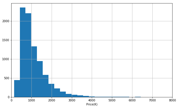
It seems like price is right-skew distributed. Most of properties has price ranging from 500-1500(k) AUD.
Viz 2
Price(K) VS Age of Property
plt.figure(figsize=(10,6))
ax2=housing.groupby('Age')['Price(K)'].mean().plot()
ax2.set_ylabel('Price(K)')
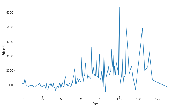
It is kind of time series data. The price shivers within age. Also, the price shivers greater as age increases. It might indicate for properties of older age, other features have greater impact on its price. However, we can still infer that the older the property is, the more expensive is if the age is lower than 125. The property older thatn 130 seems to be as expensive as the ones 50 years old.
Viz 3
Price(K) VS Year, Month, and Weekday
plt.figure(figsize=(10,6))
g1=sns.factorplot(y='Price(K)',x='Year',kind='bar',size=4, aspect =3,data=housing)
g1.ax.set_title('Price(K) VS Year')
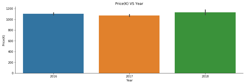
Price from 2016-2018 did not have big changes. However, it should be noticed that scale is in 1000.
plt.figure(figsize=(10,6))
g2=sns.factorplot(y='Price(K)',x='Month',kind='bar',size=4, aspect =3,data=housing)
g2.ax.set_title('Price(K) VS Month')
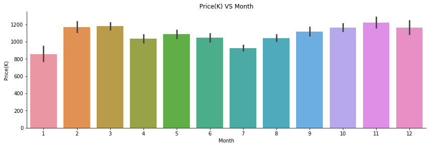
Properties sold on January and July had relatively lower price.
plt.figure(figsize=(10,6))
g3=sns.factorplot(y='Price(K)',x='Weekday',kind='bar',size=4, aspect =3,data=housing)
g3.ax.set_title('Price(K) VS Week of Day')
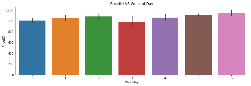
Properties sold on Wednesday had the lowest price. Should we buy a house on Wednesday then?
plt.figure(figsize=(16,6))
g4=sns.factorplot(y='Price(K)',x='Month',kind='bar',hue='Weekday',size=5, aspect =3,data=housing)
g4.ax.set_title('Price(K) VS Month')

When combining weekday with month, we can have a closer look at price difference in differnet days. It seems that Wednesday in November and Thursday in March would be a better choice. This plot can also tell us during first two months, properties were sold only on Friday. Why?? Properties were only sold on Wednesday in March and November.
Viz 4
Price(K) VS Distance
plt.figure(figsize=(12,6))
sns.regplot(x='Distance',y='Price(K)',data=housing,scatter_kws={'alpha':0.1},fit_reg=False)
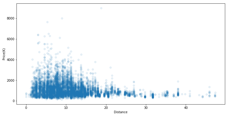
From this plot, we can two main insights:
- Most of properties have distance from 2ish to 15ish unit(miles/kms)
- The further the property is from the CBD, the less value the property has
This justifies the comman sense of the expensive properties in Melbourne CBD. Actually this rule applies to any big city!
Viz 5
Price(K) VS Number of Rooms
g5=sns.factorplot(y='Price(K)',x='Rooms',kind='bar',size=5, aspect =3,data=housing)
g5.ax.set_title('Price(K) VS Number of Rooms')
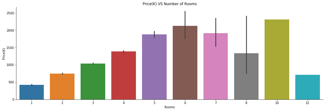
Actually, we can guess that the more room one property has, the bigger the property is. The bigger the property is, the more value it has. The guess is justified with those of 6 rooms. After it exceed 6 rooms, the rule is not applicable. SO…..Let’s Viz6
Viz6
Price(K) VS Buildingarea
plt.figure(figsize=(12,6))
ax3=sns.regplot(x='BuildingArea',y='Price(K)',data=housing,scatter_kws={'alpha':0.1},fit_reg=False)
ax3.set_title('Price(k) VS BuildingArea')
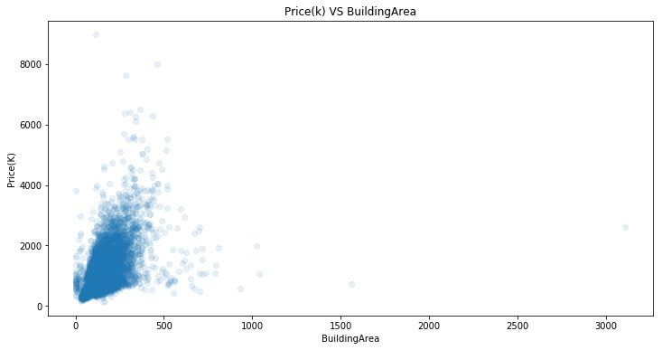
Let’s take a closer look at x:(0,1000) part. In other words, ignore extreme values (They could be outliers).
plt.figure(figsize=(12,6))
ax4=sns.regplot(x='BuildingArea',y='Price(K)',data=housing,scatter_kws={'alpha':0.3},fit_reg=False)
ax4.set_xlim((0,1100))
ax4.set_title('Price(K) VS BuildingArea(0-1100)')
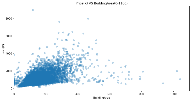
For buildingarea ranging from 0 and 400, it seems to be a positive linear trend. It is not clear due to too many overlapping points.
Viz 7
Price VS Region Name
plt.figure(figsize=(12,6))
housing.groupby('Regionname')['Price(K)'].mean().plot(kind='bar')
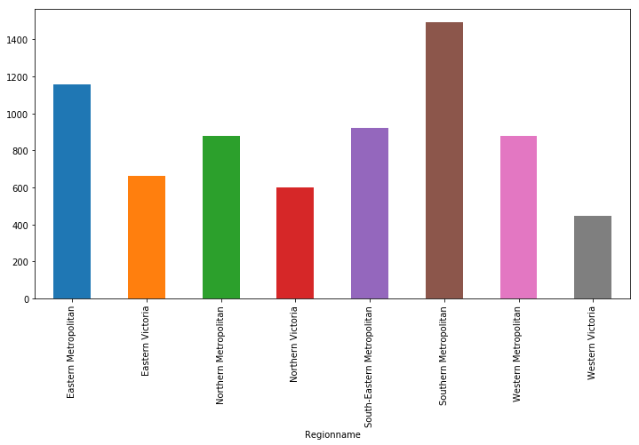
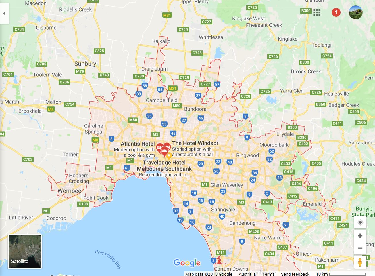
Southern Metropolitan and Eastern Metropolitan are two regions which had the highest average housing price. You must be very curious about what these two regions. Let’s take a look at Google Map!
Tableau
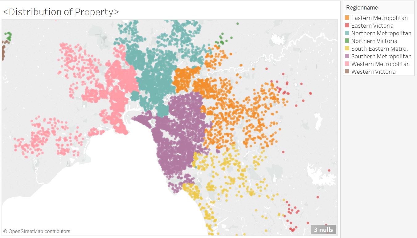
Tableau is a strong tool specifically for data visualization. With student account, we can get one-year free trial. How generous! These two regions are closer to CBD Melbourne. Also, it is clear that more properties locate around Philip Bay.
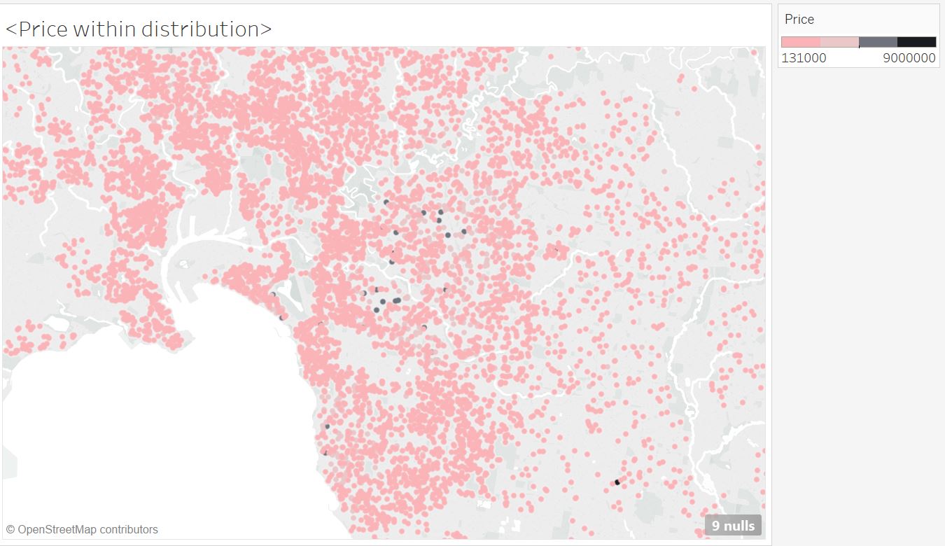
Now, you must be wondering how price differ within different locations. Python can deal with geographical information, but Tableau is a simpler way to do. All you need to do is load dataset, drag features and choose plot tyle.
** Magic 1 **
How properties locate with different regions?
How properties’ price change within different locations?
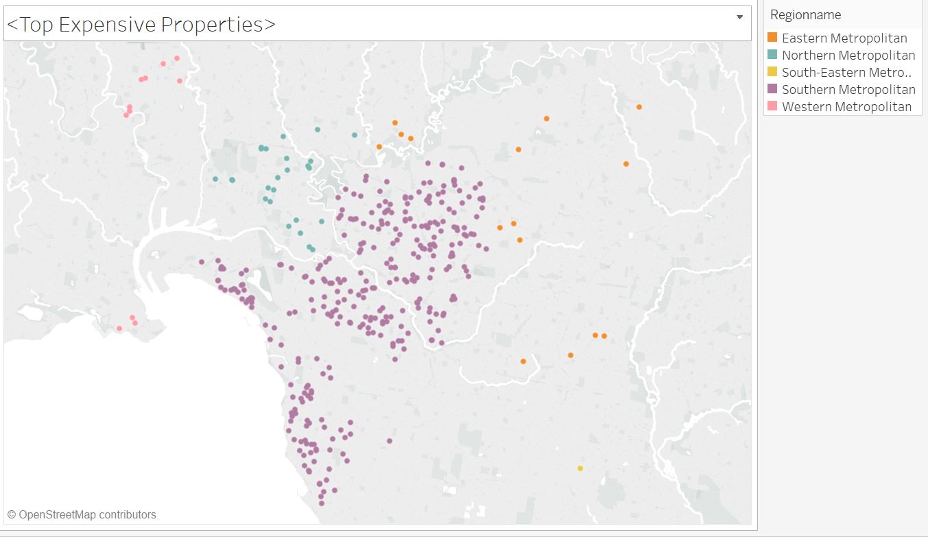
The black points represent those properties with highest price. Most of them are in Southern Metropolitan and Eastern Metropolitan.
Then just choose these luxury properties. We can find:
Yep!
Conclusion
- Visualization helps you understand data better
- various plots should be applied properly
- Outliers can be detected in the plot (extreme values are not necessarily be outliers)
- Missing values can also be visualized to find some pattern!
In the future
- Handling Missing Values is important
