Description
This project is referred from the book “Data Science take-home challenges”. The goal is to Predict conversion rate and provide recommendations for the product team and the marketing team to improve conversion rate.
Coversion is important for the product. From the dataset, we know the users’ ages, country, if he/she is a new user, source, and total pages visited. We also know if the user has been converted.
- converted: this is our label. 1 means they converted within the session, 0 means they left without buying anything. The company goal is to increase conversion rate: # conversions / total sessions.
This project is seperated into two parts. The first part is exploratory analysis of features. The second part is modeling.
Let’s get started!
Part 1. Exploratory Analysis
import pandas as pd
import numpy as np
import matplotlib.pyplot as plt
import seaborn as sns

%matplotlib inline
conversion = pd.read_csv("conversion_data.csv")
conversion.head()
| country | age | new_user | source | total_pages_visited | converted | |
|---|---|---|---|---|---|---|
| 0 | UK | 25 | 1 | Ads | 1 | 0 |
| 1 | US | 23 | 1 | Seo | 5 | 0 |
| 2 | US | 28 | 1 | Seo | 4 | 0 |
| 3 | China | 39 | 1 | Seo | 5 | 0 |
| 4 | US | 30 | 1 | Seo | 6 | 0 |
conversion.info()
<class 'pandas.core.frame.DataFrame'>
RangeIndex: 316200 entries, 0 to 316199
Data columns (total 6 columns):
country                316200 non-null object
age                    316200 non-null int64
new_user               316200 non-null int64
source                 316200 non-null object
total_pages_visited    316200 non-null int64
converted              316200 non-null int64
dtypes: int64(4), object(2)
memory usage: 14.5+ MB
The quick overview above shows the data is really clean, that is, no missing data. We have 316 thousand observations. That’s a lot. Now, let’s take a closer look at each feature.
country
user country based on the IP address
conversion.country.value_counts()
US         178092
China       76602
UK          48450
Germany     13056
Name: country, dtype: int64
There are four countries, US, China, UK, and Germany.
How conversion rate varies for different countries?
plt.figure(figsize=(10,4))
plt.title("Average conversion rate vs Country")
plt.ylabel("average conversion rate")
conversion.groupby('country')['converted'].mean().sort_values(ascending=False).plot.bar()
<matplotlib.axes._subplots.AxesSubplot at 0x1dfa713a278>
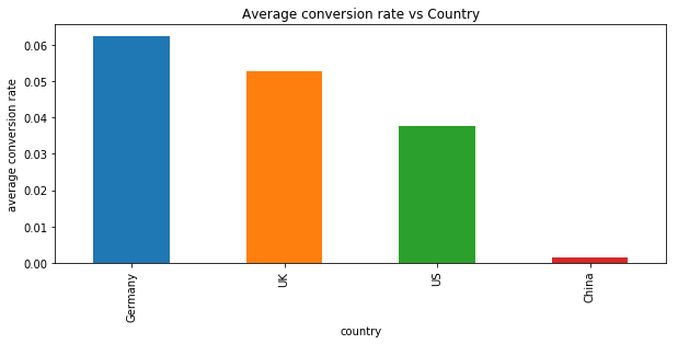
Germany has the highest average conversion rate while China has the lowest average conversion rate. It is surprising that China has the lowest since we have a lot of Chinese customers.
conversion.groupby('country')['converted'].value_counts().unstack().plot.bar(figsize=(10,4))
plt.suptitle("Converted vs Country")
plt.ylabel("Number of Users")
plt.show()
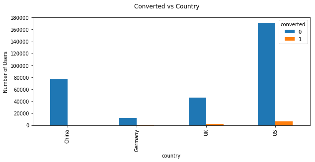
US has the most customers and converted however germany has the greatest conversion rate. In general, the conversion rate is very low.
age
user age. Self-reported at sign-in step.
age is an important feature to detect any outlier.
plt.figure(figsize=(10,4))
plt.title("Distribution of Age")
plt.xlabel("Age")
plt.hist(conversion.age,bins=30)
plt.show()
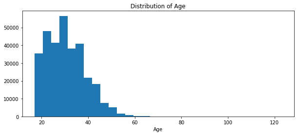
Surprisingly, there are some users older than 100. It may be the outliers
plt.figure(figsize=(10,4))
plt.title("Distribution of Age less than 80")
plt.hist(conversion[conversion.age<90].age,bins=30)
plt.show()
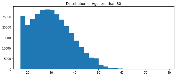
There are 6 obs older than 70. They could be outliers. Also, removing them won’t make a big difference since we got over 300 thousand obs.
conversion[conversion.age>70]
| country | age | new_user | source | total_pages_visited | converted | |
|---|---|---|---|---|---|---|
| 90928 | Germany | 123 | 0 | Seo | 15 | 1 |
| 154217 | US | 73 | 1 | Seo | 5 | 0 |
| 192644 | US | 77 | 0 | Direct | 4 | 0 |
| 208969 | US | 72 | 1 | Direct | 4 | 0 |
| 265167 | US | 79 | 1 | Direct | 1 | 0 |
| 295581 | UK | 111 | 0 | Ads | 10 | 1 |
plt.figure(figsize=(10,4))
sns.boxplot(conversion.age)
<matplotlib.axes._subplots.AxesSubplot at 0x1dfa8563ac8>
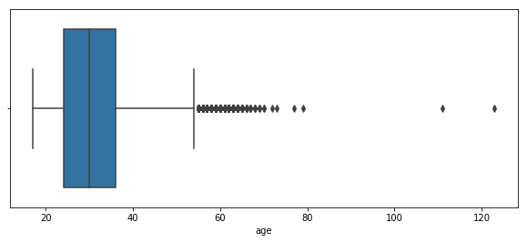
Boxplot is clearer to see there are a lot of obs out of range. We can see there are some outliers in the age. We may remove them in the latter. Now let’s remove the obs older than 80.
## remove age>80
conversion = conversion[conversion.age<80]
Then it is time to explore how conversion rate changes with users’ ages
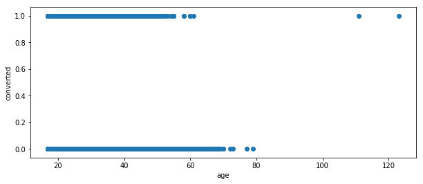
scatter plot is hard to see.
#sns.regplot(x='age',y='converted',data=conversion, fit_reg=False)
plt.figure(figsize=(10,4))
plt.ylabel("converted")
plt.xlabel("age")
plt.scatter(conversion.age,conversion.converted)
<matplotlib.collections.PathCollection at 0x1dfa869f9b0>
!
First, we set bins to sepearte ages. And then plot the average conversion rate for different age groups
bins = np.linspace(conversion.age.min(), conversion.age.max(), 7)
conversion.groupby(pd.cut(conversion.age, bins)).converted.mean()
age
(17.0, 27.333]      0.047961
(27.333, 37.667]    0.025537
(37.667, 48.0]      0.013089
(48.0, 58.333]      0.005516
(58.333, 68.667]    0.006711
(68.667, 79.0]      0.000000
Name: converted, dtype: float64
conversion.groupby(pd.cut(conversion.age, bins)).converted.mean().plot(kind='bar')
<matplotlib.axes._subplots.AxesSubplot at 0x1588f9b0e48>
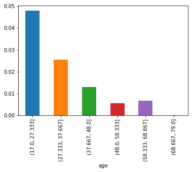
With age increasing, the average conversion rate drops
Alternatively, we can display two distribution plots for the converted and the unconverted.
plt.figure(figsize=(10,4))
plt.suptitle("Distrubution of Age for labels")
sns.distplot(conversion[conversion.converted==1].age,bins=30,label="converted=1")
sns.distplot(conversion[conversion.converted==0].age,bins=30,label="converted=0")
plt.legend()
<matplotlib.legend.Legend at 0x1dfa9981828>
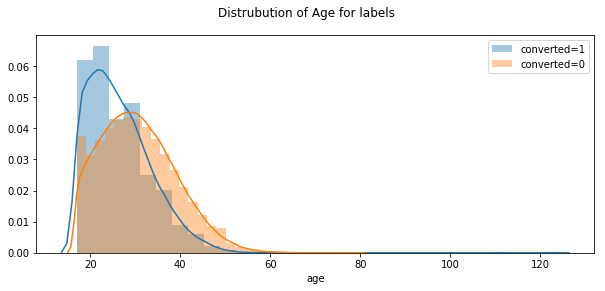
It seems that the older the customer, the lower the conversion rate. In the age part, we have removed two obs with age greater than 80
New User
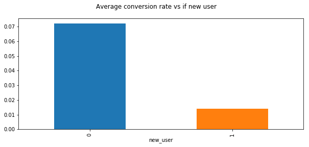
whether the user created the account during this session or had already an account and simply came back to the site
plt.figure(figsize=(10,4))
plt.suptitle("Average conversion rate vs if new user")
conversion.groupby('new_user').converted.mean().plot(kind="bar")
<matplotlib.axes._subplots.AxesSubplot at 0x1dfa74cfd68>
plt.suptitle("Converted & Unconverted with if new user")
conversion.groupby('new_user').converted.value_counts().unstack().plot.bar(figsize=(10,4))
<matplotlib.axes._subplots.AxesSubplot at 0x1dfa8553048>


<matplotlib.figure.Figure at 0x1dfa75810f0>
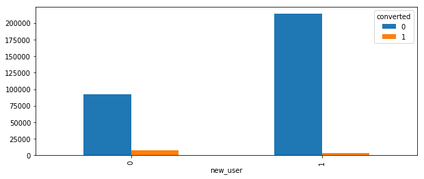
Insight: We have more new users and old users have higher conversion rate. Thus, we need to try best to convert new useres to old users.
Source
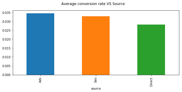
source : marketing channel source
- Ads: came to the site by clicking on an advertisement
- Seo: came to the site by clicking on search results
- Direct: came to the site by directly typing the URL on the browser
plt.suptitle("Average conversion rate VS Source")
conversion.groupby('source').converted.mean().sort_values(ascending=False).plot.bar(figsize=(10,4))
<matplotlib.axes._subplots.AxesSubplot at 0x1dfa9bde470>
conversion.groupby('source').converted.value_counts().unstack().plot.bar()
<matplotlib.axes._subplots.AxesSubplot at 0x1588fbc9668>
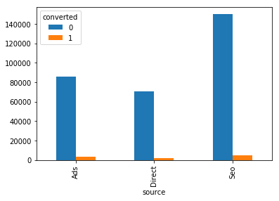
Ads source has the greatest conversion rate while most of users come to the site from search engine.
Total pages visited
total_pages_visited: number of total pages visited during the session. This is a proxy for time spent on site and engagement during the session.
plt.figure(figsize=(10,4))
plt.title("Distribution of Total Pages Visited")
plt.xlabel("Total Pages Visited")
plt.hist(conversion.total_pages_visited,bins=30)
plt.show()
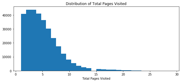
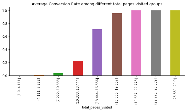
Using the qcut method in pandas, we set bins in total pages visited and display how average conversion rate changes among these groups.
bins = np.linspace(conversion.total_pages_visited.min(),conversion.total_pages_visited.max(),10)
plt.title("Average Conversion Rate among different total pages visited groups")
conversion.groupby(pd.cut(conversion.total_pages_visited,bins)).converted.mean().plot.bar(figsize=(10,4))

#conversion.groupby(pd.cut(conversion.total_pages_visited,10)).converted.mean().plot.bar()
<matplotlib.axes._subplots.AxesSubplot at 0x1dfac8c0eb8>
plt.figure(figsize=(10,4))
plt.title("Distribution of total pages visited for two labels")
sns.distplot(conversion[conversion.converted==1].total_pages_visited,bins=30,label="converted=1")
sns.distplot(conversion[conversion.converted==0].total_pages_visited,bins=30,label="converted=0")
plt.legend()
<matplotlib.legend.Legend at 0x1dfac72fa58>
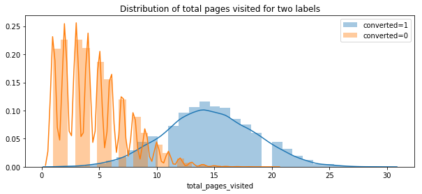
The more pages read, the greater the conversion. It is very clear. On average, the user who is converted, they read 15 pages. However, the max number of pages visited is around 15 for user who is not converted.
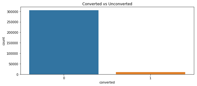
Last, let’s see the label. From the countplot, we see the data is highly inbalanced
plt.figure(figsize=(10,4))
plt.title("Converted vs Unconverted")
sns.countplot(conversion.converted)
<matplotlib.axes._subplots.AxesSubplot at 0x1dfac7bc550>
conversion.converted.mean()
0.032258064516129031
The overall conversion rate is only 3%. The data is highly inbalanced.
We are also curious about how two features influence each other.
Here are some examples:
countries vs converted
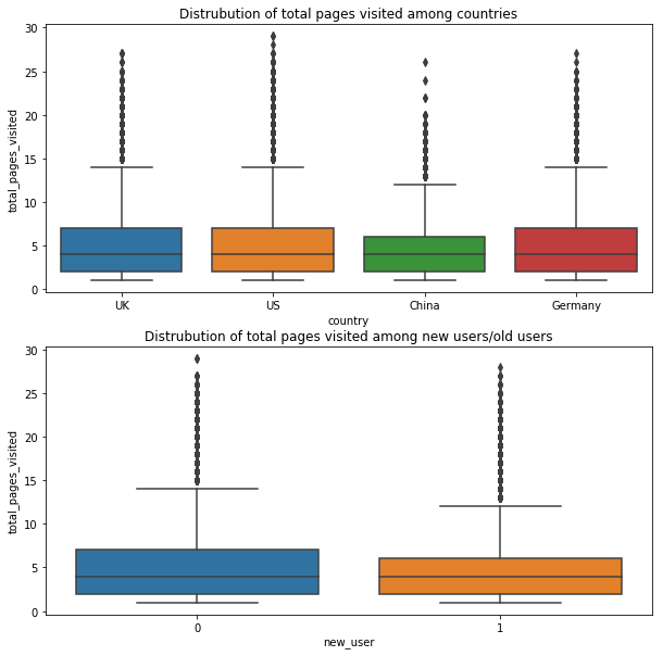
fig=plt.figure(figsize=(10,10))
ax1 = fig.add_subplot(211)
ax1.set_title("Distrubution of total pages visited among countries")
ax1=sns.boxplot(conversion.country,conversion.total_pages_visited)

ax2 = fig.add_subplot(212)
ax2.set_title("Distrubution of total pages visited among new users/old users")
ax2=sns.boxplot(conversion.new_user,conversion.total_pages_visited)
Insights
Chinese users read less pages and old users read more pages. It is important to attract Chinese users and new users.
Part 2. Modeling
From the previous exploratory analysis, we have realized that the data is highly inbalanced. We have only 3% positive cases with label=1. It indicates our baseline model has accuracy as high as 97% if we tell every obs as not converted. However, it is not practical since finding the potential converted obs is import for our business.
Imbalanced data is often a common issue in data analysis. The common solution is:
- collect more data – not feasible in this case
-
change metric
Now we cannot evaluate a model from its accuracy since the baseline can give 97% accuracy. From different requirements of business team, we can set different metrics. For example, if we care more about if we can predict if a obs will be converted or not, then we need to focus on precision. If we care more about finding all the converted, then we need to focus on the recall. To get a balance between precision and recall, we can look into F-1 score from them. ROC curve and Area under ROC curve can also be investigated. Also, for the unbalanced data, Cohen’s Kappa is a good indicator. In all, we can not only rely on accuracy.
- Resampling
- Downsampling: Sample from the majority label cases to make the number even. However, this method can remove a lot of information helpful.
- Oversampling: Resample from the minority label cases to make the number even. However, this method can add duplicate obs from the minority labels, adding inevitable bias.
-
Generate Synthetic Samples
- Try specific models
- Tree-based model could be helpful
- penalized model to give more weights to the misclassification of minortiy cases
- From different perspectives
Thanks to the reference: 8 techiniques to combat imbalanced classes in your machine learning dattaset–machinelearningmastery, Performance measures other than accuracy, imbalanced classes tutorial
In this project, I will try downsampling, and random forest classifier since we have a lot of data.
First, try the logistic regression on the original data
Before modeling, we need to preprocess data for sklearn.
Splitting data into train and test.
We find users with age>61 has zero conversion rate. Considering its range is out of 75%, we remove them.
#recall that we have some users outliers according to their ages
conversionD = conversion[conversion.age<61]
# drop redundant columns
data=pd.get_dummies(conversionD,drop_first=True)
data.info()
<class 'pandas.core.frame.DataFrame'>
Int64Index: 315963 entries, 0 to 316199
Data columns (total 9 columns):
age                    315963 non-null int64
new_user               315963 non-null int64
total_pages_visited    315963 non-null int64
converted              315963 non-null int64
country_Germany        315963 non-null uint8
country_UK             315963 non-null uint8
country_US             315963 non-null uint8
source_Direct          315963 non-null uint8
source_Seo             315963 non-null uint8
dtypes: int64(4), uint8(5)
memory usage: 13.6 MB
The data size does not change a lot.
from sklearn.model_selection import train_test_split
from sklearn.model_selection import cross_val_score
from sklearn.linear_model import LogisticRegression
from sklearn.metrics import classification_report
from sklearn.ensemble import RandomForestClassifier
from sklearn.tree import DecisionTreeClassifier
X=data.drop(['converted'],axis=1)
y=data['converted']
## train test split
X_train, X_test, y_train, y_test = train_test_split(X,y,test_size=0.2,random_state=42,stratify=y)
#lr = RandomForestClassifier(max_depth=15)
lr = LogisticRegression()
lr.fit(X_train,y_train)

y_pred = lr.predict(X_test)

print(classification_report(y_test,y_pred))
             precision    recall  f1-score   support

          0       0.99      1.00      0.99     61154
          1       0.87      0.71      0.78      2039

avg / total       0.99      0.99      0.99     63193
from sklearn.metrics import roc_auc_score
roc_auc_score(y_test,lr.predict_proba(X_test)[:,1])
0.98632931345002628
# feature importance
feat_importances = pd.DataFrame({"name":X.columns,"coef":lr.coef_[0]})
feat_importances = feat_importances[['name','coef']]
I would say the model is good as the following reasons:
- the accuracy is 99%>97%
- the f1-score of positive obs is 78%. not bad
- the precision is 87% not bad.
- ROC is 0.98, suggesting the model can distinguish two classes well.
Now, we will use random forest classifier and downsampling to handle imbalanced data issues.
Random Forest Classifier
Here we did not detail the hyperparater tuning process. In comparison, it takes more time but not better performance.
rf = RandomForestClassifier(n_estimators=100,max_depth=15)
rf.fit(X_train,y_train)

y_pred = rf.predict(X_test)

print(classification_report(y_test,y_pred))
             precision    recall  f1-score   support

          0       0.99      1.00      0.99     61154
          1       0.82      0.68      0.75      2039

avg / total       0.98      0.99      0.98     63193
Downsampling
conversionD.info()
<class 'pandas.core.frame.DataFrame'>
Int64Index: 315963 entries, 0 to 316199
Data columns (total 6 columns):
country                315963 non-null object
age                    315963 non-null int64
new_user               315963 non-null int64
source                 315963 non-null object
total_pages_visited    315963 non-null int64
converted              315963 non-null int64
dtypes: int64(4), object(2)
memory usage: 26.9+ MB
conversionD.converted.value_counts()
0    305766
1     10197
Name: converted, dtype: int64
##Referred to Elite Data Science: https://elitedatascience.com/imbalanced-classes
from sklearn.utils import resample
# Separate majority and minority classes
df_majority = conversionD[conversionD.converted==0]
df_minority = conversionD[conversionD.converted==1]

# Downsample majority class
df_majority_downsampled = resample(df_majority,
                                 replace=False,    # sample without replacement
                                 n_samples=10197,     # to match minority class
                                 random_state=25) # reproducible results

# Combine minority class with downsampled majority class
df_downsampled = pd.concat([df_majority_downsampled, df_minority])

# Display new class counts
df_downsampled.converted.value_counts()
1    10197
0    10197
Name: converted, dtype: int64
The procedure is exactly the same
dataD=pd.get_dummies(df_downsampled,drop_first=True)
XD=dataD.drop('converted',axis=1)
yD=dataD['converted']

X_trainD, X_testD, y_trainD, y_testD = train_test_split(XD,yD,test_size=0.2,random_state=42,stratify=yD)
lrD = LogisticRegression()

lrD.fit(X_trainD,y_trainD)

y_predD = lrD.predict(X_testD)

print(classification_report(y_testD,y_predD))
             precision    recall  f1-score   support

          0       0.95      0.94      0.95      2040
          1       0.94      0.95      0.95      2039

avg / total       0.95      0.95      0.95      4079
y_predD = lrD.predict(X_test)

print(classification_report(y_test,y_predD))
             precision    recall  f1-score   support

          0       1.00      0.94      0.97     61154
          1       0.35      0.94      0.51      2039

avg / total       0.98      0.94      0.95     63193
roc_auc_score(y_test,lrD.predict_proba(X_test)[:,1])
0.98637128853882938
From downsampling:
Downsampling helps improve the prediction performance on the converted case. We may sacrifice the precision to recall in the latter case. In other words, the model built on the downsampling technique can make sure most of the converted case is recognized. However, we may involve some inconverted.
It depends on the business team and cost of methods to choose the model.
Considering the overall performance, we would choose the first model.
feat_importances
| name | coef | |
|---|---|---|
| 0 | age | -0.076299 |
| 1 | new_user | -1.748463 |
| 2 | total_pages_visited | 0.749380 |
| 3 | country_Germany | 3.500880 |
| 4 | country_UK | 3.283396 |
| 5 | country_US | 2.918840 |
| 6 | source_Direct | -0.192059 |
| 7 | source_Seo | -0.030820 |
From model we can give some suggestions:
- Young generation has higher potential to be converted. Therefore, we can design more campaigns to attract young people. Since ads can lead to higher conversion rate, we may invest more on ads aimed at young people instead of elder people so that we can save resources by distrubuting them wisely.
- Total pages visited is an important factor. The longer the user stay, the more likely the user to be converted. Therefore, business team can think of more ways to retain customers on the website. We may not be certain about what makes user drop in the halfway. At least, we should not prevent users know more about the product.
- It seems that Users from UK and US are more likely to be converted. Is it because the language issue? Did we translate well on the Chinese and Gernman Version website. We should consider the language obstacle issues.
- Old users can obviously generate higher conversion rate. Do we have loyalty programs to retain old customers? Maybe we should think of ways to convert customers into old users first.
Review
- We haven’t try feature selection and interaction terms in the model. They can make a chance.